
Homestead Proper
Clarity before action.
A crack in the wall. A repair you didn’t plan for. A question you don’t know who to ask. This campaign introduces Homestead Proper as a clearer place to start, with calm guidance before the next home decision.
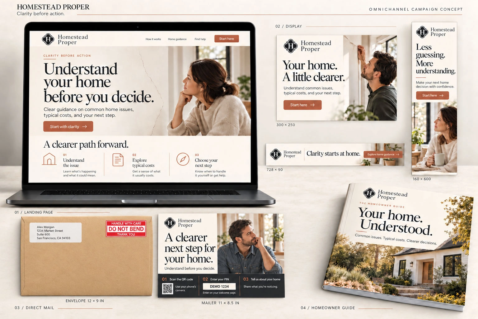
01 / THE BRIEF
A reason to pay attention.
Introduce a home guidance service without adding to a homeowner’s uncertainty. The campaign needs to explain the value quickly: understand common issues, explore typical costs, and choose a sensible next step. The invitation should feel useful and reassuring from the moment the envelope arrives.
02 / THE CREATIVE APPROACH
Clarity before action.
We centered the direction on ‘Clarity before action.’ Warm neutral colors, natural photography, and editorial typography give the work a calm, human feel. The language starts with what homeowners are noticing, then offers a manageable next step instead of rushing them toward a service request.
03 / THE DESIGNED JOURNEY
From ‘What is this?’ to ‘What comes next?’
Make the invitation personal
An 11 × 8.5-inch mailer inside a 12 × 9-inch envelope introduces ‘A clearer next step for your home.’ The message begins with understanding.
Create a simple path online
The proposed response journey uses one campaign QR code and a recipient PIN to reach a welcome page and a short set of questions about the home.
Lead with useful guidance
The homeowner guide and landing-page content explain the offer, with a clear route to explore an issue or find appropriate help.
04 / THE CAMPAIGN ASSETS
One direction. Every touchpoint.
- Mailer + envelope
- A warm, editorial mailer introduces the service and lays out three simple steps: scan the QR code, enter your PIN, and tell us about your home.
- Landing page
- ‘Understand your home before you decide’ leads into a three-part explanation: understand the issue, explore typical costs, and choose your next step.
- Display ads
- Coordinated digital formats carry reassuring messages such as ‘Your home. A little clearer.’ and ‘Less guessing. More understanding.’
- Homeowner guide design
- ‘Your home. Understood.’ gives the educational offer a tangible identity, with the same warm imagery and approachable visual hierarchy.
For a service built on trust, the creative should make the first step feel as helpful as the guidance that follows.
Campaign concepts. These examples illustrate creative strategy and asset design, rather than documented campaign launches or performance results.
LET’S BUILD WHAT’S NEXT
Your next campaign starts with a good conversation.
Have a white paper, a launch, or a story worth telling? We’ll help turn it into the creative your team needs to move forward.